~This is a brief walkthrough of the course project I worked on and plan to take forward at some point in life. Amazing journey but I do understand could have done much better had it not been for conflicting schedules/ priorities.~
This writeup (originally posted here) is part of the Capstone Project of the 8-Course Interaction Design Specialization on Coursera (Highly recommended for non-tech folk to strengthen foundations and get a flavor of the possibilities if you choose a similar career path. You can find the course at https://www.coursera.org/specializations/interaction-design).
— — — — — — — — — —
TL;DR
You can skip to the end of the article to the mini-pitch if you’re skimming through and not very interested to read about the stepping stones of the Capstone project.
— — — — — — — — — —
Week 1
As someone who’s made a recent shift to writing things down, the final assignment/ capstone project indirectly had an emotional attachment to me.

At the beginning of the project (approximately 10 weeks ago, so sometime early August,) we were given a brief to solve a problem from one of the three possible spheres/ genres: Time, Glance, or Change. After exploring a couple of options in appropriate detail. My solution was to have something which would improve a person’s productivity, and eventually was an amalgamation of all 3 genres.
The problem that I was trying to solve was a very common domestic problem which is relevant for everyone: forgetting things and especially tasks which a person might need to do and are time sensitive.
— — — — — — — — — —

Weeks 2–3
This time was mostly spent observing how people are make do with their surrounding to solve for the same problem of list making or setting reminders or a combination of the two. It was interesting to see a variety of different approaches to solve a similar problem, especially how the medium fluctuated from someone who does the same in a corporate/ workspace environment as compared to someone who’s maintaining a daily list of chores to get done.

When it came to applications, even though there are a lot of applications which probably solve the problem better from my perspective. I got a sense of why people still chose to do things analog and via pen and paper, and try to solve for the in the near future.
This course has acted like the foundation of that and the stepping stones for the journey to that. Another reason was my need to involve hardware integration in my solution which was not possible within the course’s timeframe.
— — — — — — — — — —

Weeks 4–6
This time was invested in ideation as well as trying to come up with many different approaches to solving the problem, as well as understanding the end user and how they actually went about their life. It was fascinating to obtain insights and realize how much we discover just by simply stepping back and observing the problem as a whole.

One of the challenges I faced which really changed the way I approach problem solving was to get rid of my bias for my ‘favorite’ iterations whereby I would look down upon the other approaches. Reading further on this made me realize that i’m not alone and every designer or problem solver struggles with this but eventually learns that whatever you and I propose, should eventually benefit the end user (and the business), not necessarily your ego.
— — — — — — — — — —

Weeks 7–9
After brainstorming a lot of different approaches and trying to validate them by creating quick mockups/ wireframes, the next step was to bring those solutions and proposition to the end user directly and see what they had to say about it. We also had to come up with a plan of how we go about our process and allocating time to individual tasks accordingly.

The process of getting the feedback in person was great and insightful as I discovered the preparing a script and lining up the right context for the test audience is just as important as creating the prototype itself. You can’t expect to get actionable insights and relevant data if either of the two are not done with enough focus.

Another tangent to user testing was possible by the course as the team had partnered with A/B testing which allowed me to conduct an A/B test with actual paid testers digitally, and get to interact with users probably very far away from me, who were using and going through the user scenarios of my prototype. Their feedback has been monumental as well, and helped me realize how many factors would I should keep a track of when designing my solutions.

— — — — — — — — — —
Conclusion
Thanks for reading, not much left now I promise! This journey’s been really enlightening for me as a student and as someone still relatively new with this realm of design. If you’re in Karachi and reading this, i’d love to help you sign up for the course and share a few tips/ tricks I learn on time management, as I had to manage this with a full time job, while ensuring the commitment’s still there and I get the best of both worlds.
Also, below’s a mini-pitch for the app, would be great to get your feedback on this writeup .
— — — — — — — — — —

Note-It
(Sticking with this name until further notice.)
Video URL: https://vimeo.com/238302488
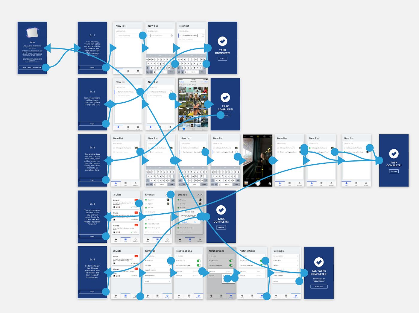
This application will allow you to quickly create a to-do list and allow you to integrate camera photos realtime or gallery images (more exciting integrations to come, soon!)

With the prototype you can try creating new tasks, add imagery to them and mark them complete. Also feel free to delete a card as well or customize your app!
Prototype URL: https://invis.io/S5DYICCVU#/257915204_Intro
— — — — — — — — — —
Fin.

