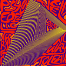
Album Art – Illustration interpretation for Neelix’s album “No Place To Leave.” Inspired by Psychedelic rock posters designed by Victor Moscoso in the 1960s.
{Disclaimer: This is fan art and in no way connected to the original album art. However, i’ve shown it to the artist and have it appreciated. Secondly, I was not high on psychedelics at any point of creating this illustration.}

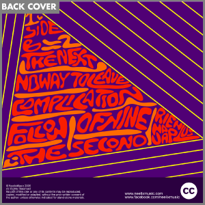
This design was part of my illustration course during my undergraduate, mentored by Shariq Chapra. I was to design an illustration which was to be applied as music album artwork. I had pitched the idea of an infinity triangle (an impossible shape,) and incorporating that into my design. It was my mentor’s suggestion to look into his style of work, and me, being a fan of psychedelic trance, gladly chose to pursue the path. Then the next step was to search for an album title which would complement this concept. After some time researching I finalized on Neelix’s album titled, “No Place To Leave”.
Not that fluent freehand, I initially spent a good hour getting the right perspective to the triangle keeping the an cd cover’s square orientation in mind. After this step it was my sketchbook and setting out the primary text [artist/title/year] over the remaining space. This was probably the part i enjoyed the most since i had the liberty to distort fonts to a very round edged, informal yet consistent letter forms to complement the psychedelic art style is Mr. Moscoso was famous for. Similarly the back cover was decorated with track name
Once this sketchwork was complete, I brought it all to illustrator to cleanly re-do the elements as sharp, consistent vectors. Me, being more comfortable using software, used this opportunity to further stylize the infinity triangle and fine tune the letterforms.
All that remained now was to create a color scheme which would complement the artwork and enhance the visual experience, while shouting psychedelic art. The psychedelic art movement was famous for striking colors with vivid outlines and juggling with multiple hues within a short workspace. Keeping all that in mind, i begun experimenting with different combinations while ensuring the contrast was maximized, and came to the conclusion that in my case nothing would be as striking as a violet and lemon yellow hue-combination.
This was a very challenging task since there were ALOT of possibilities which would have worked but they were either not print friendly or were not close to representing the artist’s style of music. But eventually finalized the design and made the remaining touches.
Below are a few more illustrations and cd album layouts by me. If you’d like to see more of these, please don’t hesitate to contact me here.
